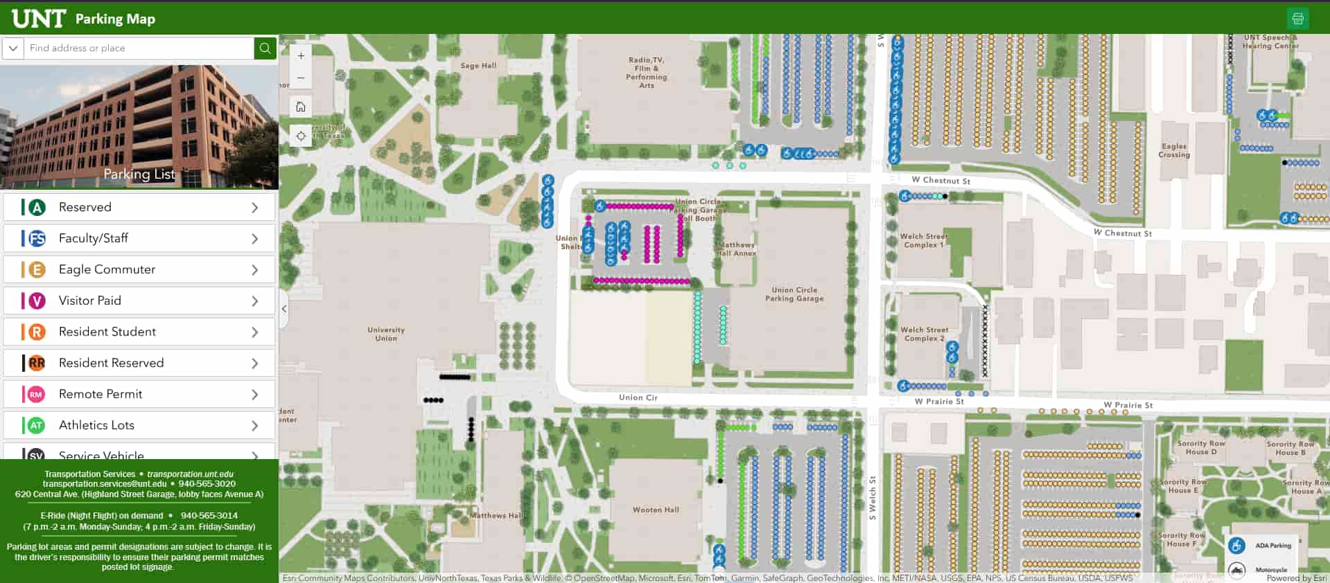
GIS Parking Map Goes Live
GIS Parking Map Goes Live
Wednesday, November 22, 2024
by Bonnie Kay Banks and Yoshua Maya
by Bonnie Kay Banks and Yoshua Maya
Our Geographic Information System (or GIS) team here at Facilities recently collaborated with our Parking and Transportation Department to create a live map of all of UNT's parking lots! This extremely helpful tool was a dedicated effort by many of our staff, including student worker Yoshua Maya - read his experience co-creating the map below:
My role in the creation of the parking map involved the map itself, its data, and the website that displays the map. I essentially did everything except verify the parking spots during the map's creation.
Working on this map made every geography class feel like light work. I learned the ins and outs of using ArcGIS Pro, polished my Python and HTML skills and even learned how to use tools like Experience Builder and Story Maps—skills I later used in two projects for my classes!
This process took about a month or two, as UNT's Transportation Services manually verified every single parking spot on campus. You might think that wouldn’t be necessary, but it revealed many changes: new parking lots, new spots and even parking lots that it turned out never existed (which scared us both!). After verification, I spent two weeks keeping my nose to the grindstone, working non-stop on my end to finish the map and website.
The map itself is hosted on Esri servers as a web map, which lets us connect it easily to any other Esri product. The benefit of this setup is that all you need is the 96 KB file and ArcGIS Pro installed, and the map can be opened almost instantly! The website was built using Experience Builder, which actually had an older version of the parking map format written in an older piece of code. When I looked at this code, it decided to update itself, and everything broke! This took a while to fix, as well as moving and modifying the map into the new format.
One funny thing I learned about our systems is that there’s a delay in our Structured Query Language—or SQL, a standard language for database creation and manipulation—servers. I spent over 30 minutes trying to change a square to a rectangle, but I ended up with circles. I then wrote a very passionate help request to one of my bosses, Koby Osowski. He couldn’t fix it either and told me to go take a break—turns out, that break was enough for the servers to catch up and update! When I came back, the square had finally turned into a rectangle. From that moment on, I understood the true power of IT—and that slow servers can sometimes cause funny things to happen.
As for how I feel about the map, I didn’t fully realize its impact until after a home game day in early November. I honestly only expected the map to be used sparingly. To me, the project was more about future-proofing the parking data for Transportation Services, students who would need it for projects and the next GIS student workers who would follow me. The following workday, I got congratulations from a lot of people, and I was genuinely puzzled.
After all the praise, I checked the map’s views and almost fell out of my chair. Thousands of people—both internal and external users—had accessed it! Between 30 and 270 people used it daily. Suffice to say, I was really proud after that.
